
chapter5 CSS3 新性能
(一)圆角边框与阴影
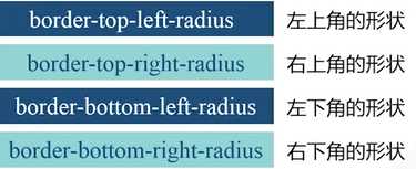
1.border-radius属性
例1
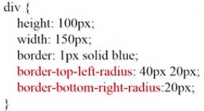
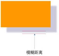
border-top-left-radius:40px 20px ; 两个值分别表示水平方向、垂直方向,内部一个椭圆。
如果只有一个值,就是一个圆。
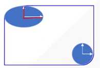
例2
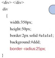
注意这里的height为50px. border-radius 是25px, 四周都有一个25半径的圆,得到左右半圆的形状。
进一步,如何做出一个圆形?width也为50px即可。
———– 补充
W3C 在制定标准的时候,新标准还没定下来,浏览器厂商为了快速加入新属性的支持,需要加前缀。等到W3C新标准确定后,全面支持,去掉前缀。
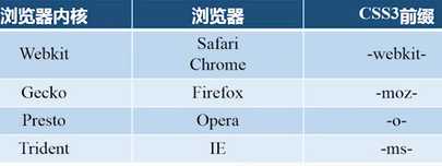
注意:用上述属性需要加上浏览器的前缀。
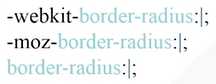
代码看起来会很繁琐。在sublime中,可以输入简写 bdrs,进行拓展可以生成标准的代码格式。
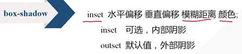
2. box-shadow属性
该属性可以做盒子的阴影。
例子
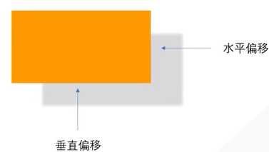
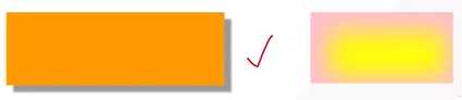
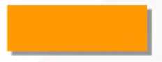
div{
    width:300px;
    height:100px;
    background-color:#f90;
    box-shadow:10px 10px 5px #88;
}
结果为
(二)文字与文本
1. text-shadow
text-shadow: 水平偏移 垂直偏移 阴影大小 颜色
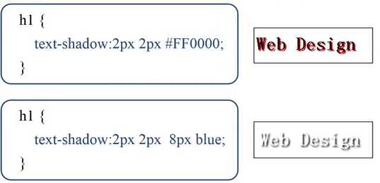
HTML内容为<h1>Web Design</h1>
如果阴影大小被省略,那么默认大小与文字一样。
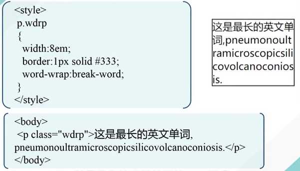
2. word-wrap
允许长单词、URL强制进行换行。
word-wrap: normal不会换行, break-word会换行
3. @font-face规则
规定一种网页上可以显示的特殊字体。
在你的网站文件夹里建一个fonts文件夹,里面存放要用的一些特殊字体。
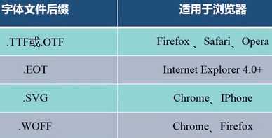
我们常用的字体是ttf后缀的,如何转换为其他后缀的字体?
例子
前提要保证fonts文件夹下有这些字体。
<style>
    @font-face{
    font-family: kastlerFont; /*定义字体的名字*/
    src:url(‘fonts/kastler.ttf‘),
         url(‘fonts/kastler.eot‘),
         url(‘fonts/kastler.woff‘),
         url(‘fonts/kastler.svg‘); /*定义字体的来源*/
    }
    p{
    font-damily:kastlerFont; /*引用字体*/
    }
</style>
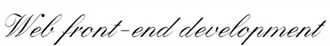
HTML内容为
<p>Web front-end development</p>
结果为
——————————————–
(三)2D转换
2D转换是对元素进行旋转、缩放、移动、拉伸
transform 属性
1. 旋转
transform:rotate(deg);
例子
CSS为
div{
    width:100px;
    height:75px;
    background-color:#ccc;
    border: 1px solid black;
}
#rotateDiv{
    transform:rotate(30deg);
}
HTML 为
<div> web前端开发</div>
<div id="rotateDiv">web前端开发</div>
效果为
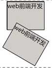
30deg 顺时针旋转30度。 sublime中可以用trsf进行扩展。
2. 缩放
transform:scale(x, y)
x为水平方向的缩放倍数;y是垂直方向的缩放倍数,若省略,同x。
0-1 缩小;大于1,为放大。
例子
.box:hover{
    transform:scale(1.2);
}
鼠标悬停时会放大。
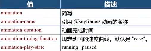
(四)过渡与动画
1. 过渡 transition
transition属性可以让一个元素的某个(多个、所有)属性在指定的时间内从一种状态过渡到另一种状态, 它有以下几个子属性
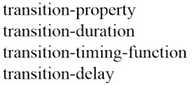
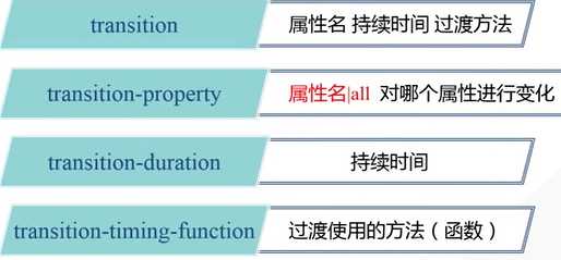
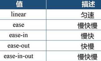
transition-duration以秒s为单位。transition-timing-function 属性取值有以下
例子
<!DOCTYPE html>
<html xmlns="http://www.w3.org/1999/xhtml">
<head>
    <title>CSS3过渡</title>
    <style type="text/css">
        div
        {
            width: 200px;
            padding:5px 10px;
            border-radius:5px;
            background-color:silver;
            transition:background-color 1s linear;
        }
        div:hover
        {
            background-color:#45B823;
        }
    </style>
</head>
<body>
    <div>web design</div>
</body>
</html>
效果,鼠标悬停时,通过1s过渡到了如下右图的状态。鼠标挪开的时候,又恢复到了原状。
例子2-所有属性的变化
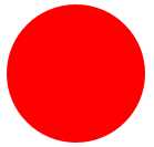
<!DOCTYPE html>
<html xmlns="http://www.w3.org/1999/xhtml">
<head>
    <title>深入了解transition属性</title>
    <style type="text/css">
        div
        {
            display:inline-block;
            width:100px;
            height:100px;
            border-radius:0;
            background-color:#14C7F3;
            transition: all 1s linear;
        }
        div:hover
        {
            border-radius:50px;
            background-color:red;
        }
    </style>
</head>
<body>
    <div></div>
</body>
</html>
效果是鼠标悬停后,蓝色方形盒子变为红色的圆形盒子。
例3
<!DOCTYPE html>
<html xmlns="http://www.w3.org/1999/xhtml">
<head>
    <title>CSS3 transition-timing-function属性</title>
    <style type="text/css">
        div
        {
            width:100px;
            height:50px;
            text-align:center;
            line-height:50px;
            margin-top:10px;
            border-radius:0;
            background-color:#14C7F3;
            transition-property:width;
            transition-duration:2s ;
            transition-delay:0;
        }

        #div1{transition-timing-function:linear;}
        #div2{transition-timing-function:ease;}
        #div3{transition-timing-function:ease-in;}
        #div4{transition-timing-function:ease-out;}
        #div5{transition-timing-function:ease-in-out}
        div:hover
        {
            width:300px;
        }
    </style>
</head>
<body>
    <div id="div1">linear</div>
    <div id="div2">ease</div>
    <div id="div3">ease-in</div>
    <div id="div4">ease-out</div>
    <div id="div5">ease-in-out</div>
</body>
</html>
效果
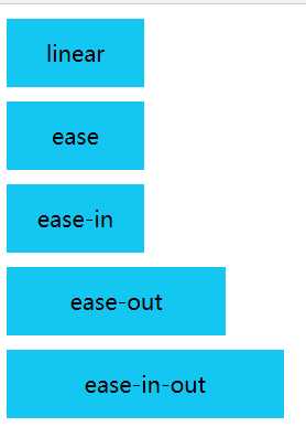
鼠标停在某个元色上,宽度增加,离开某个盒子,宽度减少。
——————————————-
2. 动画
上述的transition属性只能从一个状态过渡到另一个状态,如何实现有多个状态来完成过渡?分成两个步骤:定义动画(@keyframes规则)–> 调用动画(animation属性)
@keyframes规则 (关键帧)
animation :动画名字 时间 变化函数 播放状态;
最后的animation-play-state属性可以控制动画播放的状态,比如在鼠标悬停的时候播放,当鼠标离开的时候停止播放。
例子
<!DOCTYPE html>
<html lang="en">
<head>
    <meta charset="UTF-8">
    <title>Document</title>
    <style>
    div{
        width: 100px;
        height: 100px;
        background-color: black;
    }
    @keyframes mycolor
     {
        0%     {background-color:red;}
        30%   {background-color:blue;}
        60%   {background-color:yellow;}
        100% {background-color:green;}
    }
     div:hover
    {
        animation: mycolor 5s linear;
    }
    </style>

</head>
<body>
<div class = "box"></div>
</body>
</html>
四个帧,每一帧的名字用百分号表示,0%表示最开始的时候,100%表示最后播放完的时候。
(五)3D变换
transform-style: preserve-3d
transform:rotateX(),rotateY(), rotateZ()
透视 perspective属性,实现近大远小的效果。单纯的二维变化没有透视关系。
perspective:100x, 表示眼睛离水平面的距离。越大,透视效果不明显,越小则透视效果明显。该属性要定义在上一层元素的样式里。
例子
<!DOCTYPE html>
<html lang="en">
<head>
    <meta charset="UTF-8">
    <title>3D</title>
    <style>
    #stage{
        width: 300px;
        margin: 100px auto;
        perspective:200px;
    }
    .box{
        width: 100px;
        height:100px;
        float:left;
        transition:linear 1s;
        transform-style: preserve-3d;
    }
    img
    {
        width:100px;
        height:75px;
    }
    .x:hover
    {
        transform:rotateX(60deg);
    }
    .y:hover
    {
        transform:rotateY(60deg);
    }
    .z:hover
    {
        transform:rotateZ(60deg);
    }
    </style>

</head>
<body>
<div id="stage">
    <div class="box x"> <img src="frog.jpg" /></div>
    <div class="box y"> <img src="frog.jpg" /></div>
    <div class="box z"> <img src="frog.jpg" /></div>
</div>
</body>
</html>
上述定义一个最外面的舞台stage, 父容器box。图片是内容。每个图片都在父容器里。第一幅沿着X轴旋转。class引用多个类别,中间空格隔开就行。
————————
3D变换综合案例- 卡片的旋转
当鼠标悬停在图片时,图片翻转(沿着Y轴),背面有文字出现。
如何实现?
**思路:把图片和文字放在一个父容器里,每个父容器里都有两张图片,通过层定位让图片和文字有叠加的效果。先显示图片,当鼠标悬停的时候,通过3D变换,让后面的文字显示出来。
先做HTML基本结构
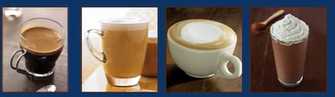
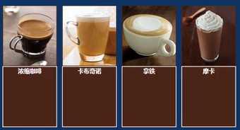
<!DOCTYPE html>
<html lang="en">
<head>
    <meta charset="UTF-8">
    <title>Document</title>
    <style>
        *{
            padding: 0;
            margin: 0;
        }
        body{
            background-color:#0D3462;
        }

    </style>
</head>
<body>
    <div id="piclist">   <!最外面的大舞台,里面四个容器,每个容器放两个元素!>
        <div class="picbox">
            <div class="face front"><img src="images/1.jpg"></div> <!正面!>
            <div class="face back"><h3>浓缩咖啡</h3></div>
        </div>
        <div class="picbox">
            <div class="face front"><img src="images/2.jpg"></div>
            <div class="face back"><h3>卡布奇诺</h3></div>
        </div>
        <div class="picbox">
            <div class="face front"><img src="images/3.jpg"></div>
            <div class="face back"><h3>拿铁</h3></div>
        </div>
        <div class="picbox">
            <div class="face front"><img src="images/4.jpg"></div>
            <div class="face back"><h3>摩卡</h3></div>
        </div>
    </div>
</body>
</html>
得到效果为
……
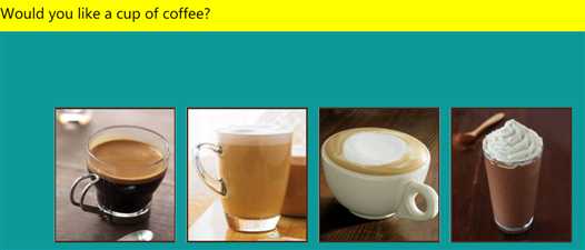
上述只是简单设置了样式,接下来对样式进行细化。
<!DOCTYPE html>
<html lang="en">
<head>

    <title>Document</title>
    <style>
        *{
            padding: 0;
            margin: 0;
        }
        body{
            background-color:#0D9999;
        }
        p{
            height:50px;
            background-color:yellow;
            font-size:20px;
            line-height:50px;
        }
        /*舞台*/
        #piclist{
            width:760px; /*170*4+10*8*/
            height: 220px;/*190+边框*/
            margin: 100px auto; /*距离上边距100px 水平居中*/
        }
        /*父容器*/
        .picbox{
            float: left; /*需要水平排列成一行*/
            position: relative;
            width: 170px;
            height: 190px;
            margin: 10px;
            transform-style:preserve-3d; /*3d变化设置在父容器里*/
            transition:1.5s; /*1.5S内完成变换*/
        }
        /*鼠标悬停,就翻转,正面背面互换*/
        .picbox:hover{
            transform:rotateY(180deg);
        }
        .face{
            position: absolute;
            width:170px;  /*图片宽度*/
            height:190px;  /*图片高度*/
        }
        .front{
            border:2px solid #4b2518; /*棕色边框*/
        }
        .back{
            /*让它成为背面,开始只显示正面*/
            transform:rotateY(180deg);    /*关键!!!*/
            background-color: #4b2518;
            border:2px solid #fff;
        }
        .back h3{
            color:white;
            text-align:center;
            line-height: 190px;/*与父容器一样高,实现文字垂直居中*/
        }
    </style>
</head>
<body>
<p> Would you like a cup of coffee? </p>
    <div id="container">
        <div id="piclist">
            <div class="picbox">
                   <div class="face front"><img src="images/1.jpg" /></div>
                <div class="face back"><h3>Espresso</h3></div>
            </div>
            <div class="picbox">
                   <div class="face front"><img src="images/2.jpg" /></div>
                <div class="face back"><h3>Cappuccino</h3></div>
            </div>
            <div class="picbox">
                   <div class="face front"><img src="images/3.jpg" /></div>
                <div class="face back"><h3>Latte</h3></div>
            </div>
            <div class="picbox">
                <div class="face front"><img src="images/4.jpg"/></div>
                <div class="face back"><h3>Mocha</h3></div>
            </div>
        </div>
    </div>
</body>
</html>
效果
注意:
(1)back的样式,如果没有transform:rotateY(180deg);,那么当图片翻转的时候文字也是翻转的。因此让初始的文字先翻转一下,当光标停留的时候再翻转过来,这样文字就正确了。
(2)父元素是relative,子元素face 为absolute. 那么正面图片、反面文字针对父元素都是绝对定位,他们原有文档流的位置丢失,就会层叠到一起。position 之后没有设置left right等距离,两个元素层叠在一起。