前面我们简单的介绍了一下android的五大布局,那么现在我们来实践一下,写一个简单的微信界面
首先,我们新建一个weixin.xml的linnerlayout布局
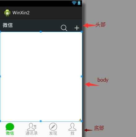
我们日常使用的微信,从简单的方面来说我可一分成三个内容,头部标签栏,中间显示信息栏,还有一个底部。那么我们就按照这个来先建一个页面
 1 <?xml version="1.0" encoding="utf-8"?>
 2 <LinearLayout xmlns:android="http://schemas.android.com/apk/res/android"
 3     android:layout_width="match_parent"
 4     android:layout_height="match_parent"
 5     android:orientation="vertical" >
 6     <!-- head -->
 7     <LinearLayout
 8         android:layout_width="match_parent"
 9         android:layout_height="wrap_content" >
10     </LinearLayout>
11
12     <!-- 中间 -->
13     <LinearLayout
14         android:layout_width="match_parent"
15         android:layout_height="wrap_content"
16     </LinearLayout>
17
18     <!-- 底部 -->
19     <LinearLayout
20         android:layout_width="match_parent"
21         android:layout_height="wrap_content" >
22     </LinearLayout>
23
24 </LinearLayout>
效果如下:
这是完成后的显示

那么要怎么实现到这个效果,
1.先创建一个标题栏的layout文件
 1 <?xml version="1.0" encoding="utf-8"?>
 2 <LinearLayout xmlns:android="http://schemas.android.com/apk/res/android"
 3     android:layout_width="match_parent"
 4     android:layout_height="50dp"
 5     android:orientation="horizontal"
 6     android:background="#21292c">
 7
 8     <TextView
 9         android:id="@+id/textView1"
10         android:layout_width="wrap_content"
11         android:layout_height="wrap_content"
12         android:text="@string/weixin"
13         android:textColor="#ffffff"
14         android:textSize="20sp"
15         android:layout_gravity="center"
16         android:padding="10dp"/>
17
18     <TextView
19         android:layout_width="wrap_content"
20         android:layout_marginTop="20dp"
21         android:layout_height="30dp"
22         android:layout_weight="1"
23         android:gravity="bottom" />
24
25     <LinearLayout
26         android:layout_width="wrap_content"
27         android:layout_height="match_parent"
28         android:gravity="bottom">
29
30         <ImageView
31             android:id="@+id/imageView2"
32             android:layout_width="40dp"
33             android:layout_height="30dp"
34             android:src="@drawable/fdj"
35             android:layout_marginRight="10dp"/>
36
37         <ImageView
38             android:id="@+id/imageView1"
39             android:layout_width="40dp"
40             android:layout_height="30dp"
41             android:src="@drawable/barbuttonicon_add" />
42
43     </LinearLayout>
44
45 </LinearLayout>
然后我们在创建一个底部的文件的
 1 <?xml version="1.0" encoding="utf-8"?>
 2 <LinearLayout xmlns:android="http://schemas.android.com/apk/res/android"
 3     android:layout_width="match_parent"
 4     android:layout_height="match_parent"
 5     android:orientation="horizontal" >
 6
 7     <RadioGroup
 8         android:id="@+id/radioGroup1"
 9         android:layout_width="match_parent"
10         android:layout_height="60dp"
11         android:orientation="horizontal"
12         android:background="@drawable/group_buton_nomal"
13         android:gravity="center">
14
15         <RadioButton
16             android:id="@+id/radio0"
17             android:layout_width="wrap_content"
18             android:layout_height="wrap_content"
19             android:checked="true"
20             android:text="@string/weixin"
21                style="@style/radioStyle"
22                android:drawableTop="@drawable/tab_weixin"/>
23
24         <RadioButton
25             android:id="@+id/radio1"
26             android:layout_width="wrap_content"
27             android:layout_height="wrap_content"
28             android:text="@string/addressList"
29                style="@style/radioStyle"
30                android:drawableTop="@drawable/tab_address"/>
31
32         <RadioButton
33             android:id="@+id/radio2"
34             android:layout_width="wrap_content"
35             android:layout_height="wrap_content"
36             android:text="@string/find"
37                style="@style/radioStyle"
38                android:drawableTop="@drawable/tab_find"/>
39
40          <RadioButton
41             android:id="@+id/radio3"
42             android:layout_width="wrap_content"
43             android:layout_height="wrap_content"
44             android:text="@string/set"
45                style="@style/radioStyle"
46                android:drawableTop="@drawable/tab_set"/>
47     </RadioGroup>
48
49 </LinearLayout>
底部文件采用的是单选按钮组,这里我就不过多解释了,跟HTML的单选按钮类似
上面的用到的style是自己设计的一个按钮样式,放在style.xml的文件里,具体代码如下
1 <style name="radioStyle">
2         <item name="android:button">@null</item>
3         <item name="android:layout_weight">1</item>
4         <item name="android:gravity">center</item>
5         <item name="android:textColor">@drawable/text_color</item>
6     </style>
为了让让底部的显示效果更加的接近我们日常使用的微信,我们对按钮做了一个判断,就是使用selector(不懂的请看下一章)
代码如下:
1 <?xml version="1.0" encoding="utf-8"?>
2 <selector xmlns:android="http://schemas.android.com/apk/res/android" >
3     <item android:state_checked="true"
4         android:drawable="@drawable/tabbar_contacts_hl"></item>
5     <item
6         android:drawable="@drawable/tabbar_contacts"></item>
7
8 </selector>
就是通过焦点是否在该按钮上,在的化显示有颜色的图片,不在的化显示没颜色的。对其他桑按钮同样的操作,代码一样,只是把图片换一下就OK了。
还有文字也进行了相同的操作
1 <?xml version="1.0" encoding="utf-8"?>
2 <selector xmlns:android="http://schemas.android.com/apk/res/android" >
3     <item android:state_checked="true"
4         android:drawable="@drawable/tabbar_contacts_hl"></item>
5     <item
6         android:drawable="@drawable/tabbar_contacts"></item>
7
8 </selector>
好了,一切准备,就绪,我们只需要将一切和起来就可以了。我们可以在weixin.xml通过include的标签把这些包含进来
<?xml version="1.0" encoding="utf-8"?>
<LinearLayout xmlns:android="http://schemas.android.com/apk/res/android"
    android:layout_width="match_parent"
    android:layout_height="match_parent"
    android:orientation="vertical" >
    <!-- head -->
    <LinearLayout
        android:layout_width="match_parent"
        android:layout_height="wrap_content" >
        <include layout="@layout/head"/>
    </LinearLayout>

    <!-- 中间 -->
    <LinearLayout
        android:layout_width="match_parent"
        android:layout_height="wrap_content"
        android:layout_weight="1">
    </LinearLayout>

    <!-- 底部 -->
    <LinearLayout
        android:layout_width="match_parent"
        android:layout_height="wrap_content" >
        <include layout="@layout/bottom"/>
    </LinearLayout>

</LinearLayout>
这样一个简单的微信界面就准备h好了
但是你运行的时候是不是觉得不对劲,跟我们的实际用的微信不一样,那是因为多了一个系统默认的标题栏,我们把他去掉就可以了。
在AndroidManifest.xml的作一下的修改即可

那样一个见到你微信布局就完成了.