一、浮动
1、三个属性:left、right、none.
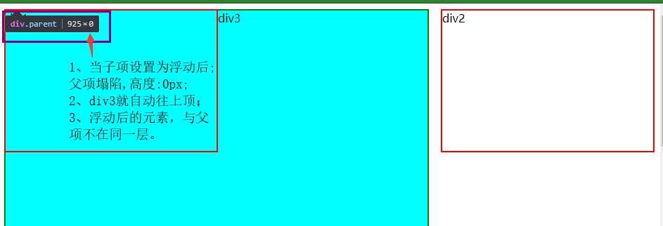
2、特点:容易造成父项塌陷,故在父项需要清除浮动
3、父项塌陷现象

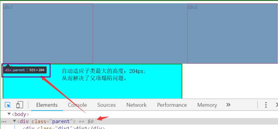
4、父项塌陷解决方案(建议使用):清除浮动
        .parent:after{
            content:"";
            display: block;
            clear:both;
        }


<!DOCTYPE html>
<html lang="en">
<head>
    <meta charset="UTF-8">
    <title>解决父项塌陷</title>
    <style type="text/css">
        .parent{
            width: 100%;
            background-color: rgba(0,0,0,0.5)
        }
        .div1,.div2{
            width: 300px;
            height: 200px;
            border:2px solid red;
        }
        .div3{
            width: 600px;
            height:500px;
            border: 2px solid green;
            background-color: aqua;
        }
        .div1{
            float:left;
        }
        .div2{
            float:right;
        }
        /*解决父项塌陷核心代码*/
        .parent:after{
            content:"";
            display: block;
            clear:both;
        }
    </style>
</head>
<body>
    <div class="parent">
        <div class="div1">div1</div>
        <div class="div2">div2</div>
    </div>
    <div class="div3">div3</div>


</body>
</html>
父项塌陷及解决方案代码
二、定位(position)
初始状态
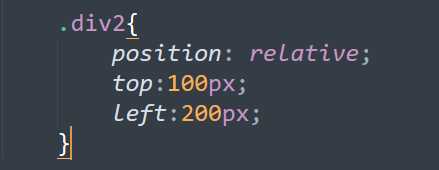
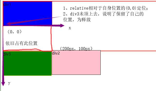
1、相对浮动特点(relative):
-
- 相对于自身位置进行坐标移动;
- 占位置,原位置保留
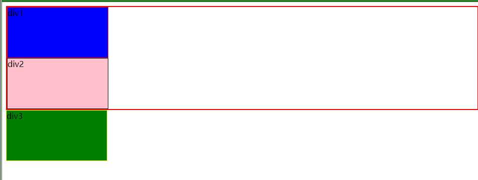
2、绝对浮动(absolute)
-
- 相对于父项进行移动
- 不占位置,原先位置不保留
- 会造成父项塌陷
3、塌陷现象演示和分析
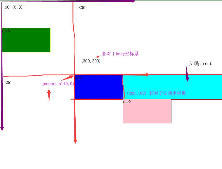
图中parent塌陷只剩下div1的高度;
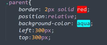
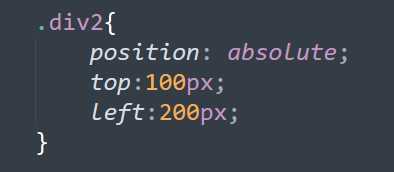
<!DOCTYPE html>
<html lang="en">
<head>
    <meta charset="UTF-8">
    <title>absolute定位中的塌陷</title>
    <style type="text/css">
        .parent{
            border: 2px solid red;
            position:relative;
            background-color: aqua;
            left:300px;
            top:300px;

        }

        .div1{
            width: 200px;
            height:100px;
            border:1px solid red;
            background-color: blue;
        }
        .div2{
            width: 200px;
            height:100px;
            border:1px solid black;
            background-color: pink;
        }
        .div3{
            width: 200px;
            height:100px;
            border:1px solid yellow;
            background-color: green;
        }
/*        .div1{
            position:relative;
            top:300px;
            left:400px;
        }*/

        .div2{
            position: absolute;
            top:100px;
            left:200px;
        }

    </style>
</head>
<body>
    <div class="parent">
        <div class="div1">div1</div>
        <div  class="div2">div2</div>
    </div>
    <div  class="div3">div3</div>

</body>
</html>
absolute塌陷现象代码
三、圆形头像的制作
1、overflow溢出属性
| 值 | 描述 |
|---|---|
| visible | 默认值。内容不会被修剪,会呈现在元素框之外。 |
| hidden | 内容会被修剪,并且其余内容是不可见的。 |
| scroll | 内容会被修剪,但是浏览器会显示滚动条以便查看其余的内容。 |
| auto | 如果内容被修剪,则浏览器会显示滚动条以便查看其余的内容。 |
| inherit | 规定应该从父元素继承 overflow 属性的值。 |
2、圆形头像代码

<!DOCTYPE html>
<html lang="en">
<head>
    <meta charset="UTF-8">
    <title>圆形头像</title>
    <style type="text/css">
        div{
            width:200px;
            height: 200px;
            border:2px solid orangered;
            border-radius: 50%;
            overflow: hidden;

        }
        div img{
            width: 100%;

        }

    </style>
</head>
<body>
    <div>
        <img src="3.png">

    </div>


</body>
</html>
圆形头像代码

四、简陋制作模态样式
1、模态样式是什么

2、制作简单的模态样式
<!DOCTYPE html>
<html lang="en">
<head>
    <meta charset="UTF-8">
    <title>模态样式</title>
    <style type="text/css">
        body{
            width:auto;
            height:auto;
            margin: 0px;
        }
        .div2{
            /*内容层*/
            width:100%;
            height: 800px;
            border: 2px solid red;
            background-color: aqua;

        }
        .div3{
            /*透明层*/
            width:100%;
            height: 1200px;
            border: 2px solid black;
            background-color: rgba(0,0,0,0.3);
            position: absolute;
            left:0px;
            top:0px;
            z-index: 80;
            /*如果出现覆盖现象,显示z-index较大的元素内容*/
        }
        .div4{
            /*输入层*/
            width:500px;
            height:300px;
            border: 2px solid red;
            background-color: white;
            position: absolute;
            left:50%;
            top:50%;
            margin-top:-150px;
            margin-left: -250px;
            z-index: 100;
        }
    </style>
</head>
<body>
    <div>鹅鹅鹅</div>
    <span>曲项向天歌</span>
    <div class="div2"></div>
    <div class="div3"></div>
    <div class="div4">123456</div>
</body>
</html>
模态样式制作代码
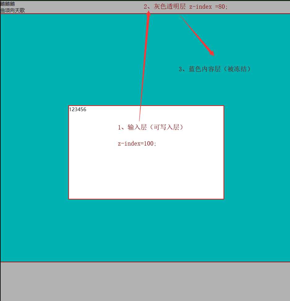
3、z-index :数值越大的才能被操作,其他的被冻结
最后好文推荐:https://www.cnblogs.com/clschao/articles/10082587.html