网页布局居中必不可少,其中包括水平居中,垂直居中,上下左右居中,下面一一详述。
水平居中
<div class="container">
  <div class="item">居中</div>
</div>
1.text-align: center;

  对父元素设置text-align: center;子元素即可居中。但子元素是有限制的,只对图片,文字等行内元素有效。
  如果子元素有一定宽度,可以设置子元素display:inline-block;
  <style>
    .container {
      text-align: center;
    }

    .item{
      display: inline-block;
      width: 100px;
      background-color: #ff266e;
    }

  </style>
效果
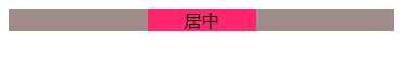
2.margin: 0 auto;

  元素本身设置 margin: 0 auto; 这种方法对能设置宽度的元素起作用.
  <style>
    .container {
      text-align: center;
      background-color: #a08b8b;
    }

    .item{
      margin: 0 auto;
      width: 100px;
      background-color: #ff266e;
    }

  </style>
效果

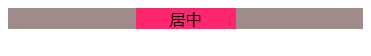
3.position:absolute;
这种方法也需要固定元素的宽度.
  <style>
    .container {
      text-align: center;
      position: relative;
    }

    .item{
      position: absolute;
      width: 100px;
      left: 0;
      right: 0;
      margin: auto;
      background-color: #ff266e;
    }

  </style>
效果

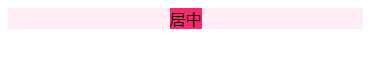
4.flex
  <style>
    .container {
      text-align: center;
      display: flex;
      justify-content: center;
      background-color: #ffecf7;
    }

    .item{
      background-color: #ff266e;
    }

  </style>
效果
垂直居中
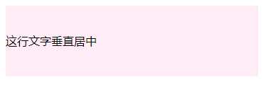
1.一行文字垂直居中
  <style>
    .center {
      height: 100px;
      line-height: 100px;
      background-color: #ffecf7;
    }
  </style>
<div class="center">
  这行文字垂直居中
</div>
效果
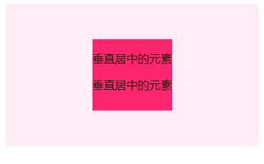
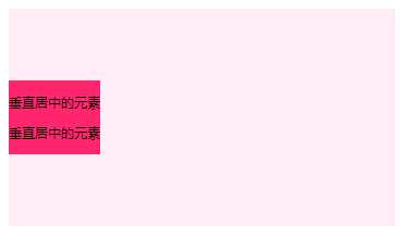
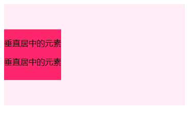
2.未知高度元素居中
第一种方法
<div class="container">
  <div class="item">
    <p>垂直居中的元素</p>
    <p>垂直居中的元素</p>
  </div>
</div>

  <style>
    .container {
      font-size: 0;
      background-color: #ffecf7;
      height: 200px;
    }
    .container:after {
      content: ‘‘;
      display: inline-block;
      vertical-align: middle;
      height: 100%;
    }
    .item {
      display: inline-block;
      vertical-align: middle;
      font-size: 12px;
      background-color: #ff266e;
    }
  </style>
第二种方法
  <style>
    .container {
      display: flex;
      background-color: #ffecf7;
      height: 200px;
      align-items: center;
    }

    .item {
      height: 100px;
      background-color: #ff266e;
    }
  </style>
效果
3.高度已知垂直居中
第一种方法
<div class="container">
  <div class="item">
    <p>垂直居中的元素</p>
    <p>垂直居中的元素</p>
  </div>
</div>

  <style>
    .container {
      position: relative;
      background-color: #ffecf7;
      height: 200px;
    }

    .item {
      position: absolute;
      top: 0;
      bottom: 0;
      margin: auto;
      height: 100px;
      background-color: #ff266e;
    }
  </style>
第二种方法
  <style>
    .container {
      position: relative;
      background-color: #ffecf7;
      height: 200px;
    }

    .item {
      position: absolute;
      top: 50%;
      margin-top: -50px;
      height: 100px;
      background-color: #ff266e;
    }
  </style>
第三种方法
  <style>
    .container {
      position: relative;
      background-color: #ffecf7;
      height: 200px;
    }

    .item {
      position: absolute;
      top: 50%;
      transform: translate(0,-50%);
      height: 100px;
      background-color: #ff266e;
    }
  </style>
效果
上下左右居中
上下垂直居中,把上面的综合起来就可以啦
1.子元素宽和高不确定
第一种方法
  <style>
    .container {
      display: flex;
      background-color: #ffecf7;
      height: 200px;
      align-items: center;
      justify-content: center;
    }

    .item {
      background-color: #ff266e;
    }
  </style>
第二种方法
  <style>
    .container {
      background-color: #ffecf7;
      height: 200px;
      font-size: 0;
      text-align: center;
    }
    .container:after {
      content: ‘‘;
      display: inline-block;
      height: 100%;
      vertical-align: middle;
    }

    .item {
      display: inline-block;
      background-color: #ff266e;
      vertical-align: middle;
      font-size: 12px;
    }
  </style>
2.子元素宽和高确定
第一种方法
  <style>
    .container {
      position: relative;
      background-color: #ffecf7;
      height: 200px;
    }


    .item {
      position: absolute;
      top: 0;
      bottom: 0;
      left: 0;
      right: 0;
      margin: auto;
      width: 120px;
      height: 120px;
      background-color: #ff266e;

    }
  </style>
第二种方法
  <style>
    .container {
      position: relative;
      background-color: #ffecf7;
      height: 200px;
    }


    .item {
      position: absolute;
      top: 50%;
      left: 50%;
      margin: -60px -60px;  /*宽,高的一半*/
      width: 120px;
      height: 120px;
      background-color: #ff266e;

    }
  </style>
第三种方法
  <style>
    .container {
      position: relative;
      background-color: #ffecf7;
      height: 200px;
    }


    .item {
      position: absolute;
      top: 50%;
      left: 50%;
      transform: translate(-50%,-50%);
      width: 120px;
      height: 120px;
      background-color: #ff266e;

    }
  </style>