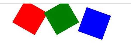
一、 形变中心点介绍
    <style>

        ul li {

            width: 100px;

            height: 100px;

            list-style: none;

            float:left;

            margin:0 auto;

            /*transform-origin:200px 0px;*/

            transform-origin:80% 80%;

            /*第一个参代表水平方向,第二个参数代表垂直方向,注意点:取值有三种形式,具体像素,百分比*/

        }

        ul li:nth-child(1){

            /*默认情况下,所有的元素都是以自己的中心点进行旋转的,我们可以通过改变形变的中心点*/

            background-color: red;

            transform:rotate(30deg);

        }

        ul li:nth-child(2){

            background-color: green;

            transform:rotate(60deg);

        }

        ul li:nth-child(3){

            background-color: blue;

            transform:rotate(110deg);

        }

........省略代码.......

<ul>

    <li></li>

    <li></li>

    <li></li>

</ul>

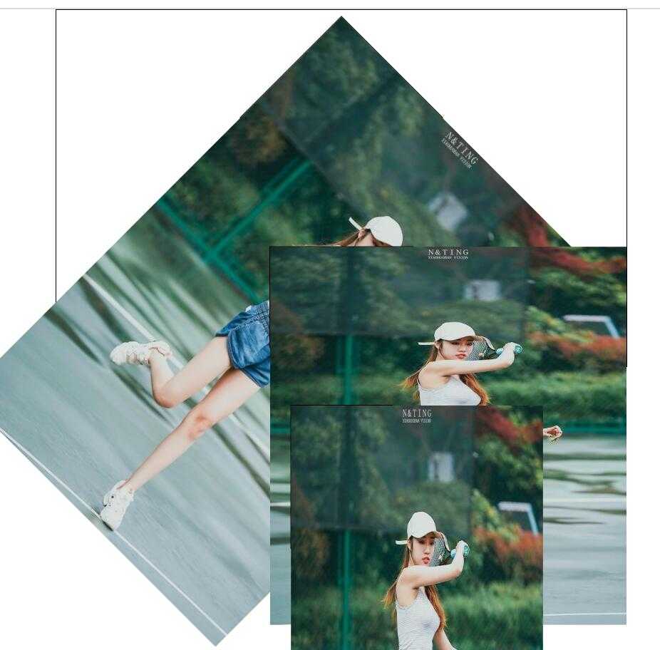
二、 形变中心轴
  <style>

        *{

            margin:0;

            padding:0;

        }

        ul{

            width: 800px;

            height: 500px;

            border:1px solid black;

            margin:0 auto;

?

        }

        ul li {

            list-style: none;

            width: 200px;

            height: 200px;

            margin:0 auto;

            margin-top:50px;

            border:1px solid black;

?

        }

        ul li image{

            width: 200px;

            height: 200px;

        }

        ul li:nth-child(1){

            /*默认情况下所有的元素都是围绕Z轴进行旋转的*/

            transform:rotateZ(45deg);

        }

        ul li:nth-child(2){

            /*默认情况下所有的元素都是围绕Z轴进行旋Y转的*/

            transform:rotateX(45deg);

        }

        ul li:nth-child(3){

            /*默认情况下所有的元素都是围绕Z轴进行旋转的*/

            transform:rotateY(45deg);

        }

        /*总结:想要围绕哪个轴旋转,那么只需要在rotate后面加上哪个轴即可*/

..........省略代码.......

<ul>

    <li><img src="image/play_tennis.jpg" ></li>

    <li><img src="image/play_tennis.jpg" ></li>

    <li><img src="image/play_tennis.jpg" ></li>

</ul>
三、源码:
D169_ShapeChangePoint.html
D170_RotateAxialDirection.html
地址:
https://github.com/ruigege66/HTML_learning/blob/master/D169_ShapeChangePoint.html
https://github.com/ruigege66/HTML_learning/blob/master/D170_RotateAxialDirection.html
2.CSDN:https://blog.csdn.net/weixin_44630050
3.博客园:https://www.cnblogs.com/ruigege0000/
4.欢迎关注微信公众号:傅里叶变换,个人账号,仅用于技术交流,后台回复“礼包”获取Java大数据学习视频礼包