uniapp兼容多端自定义模态弹框组件UAPopup
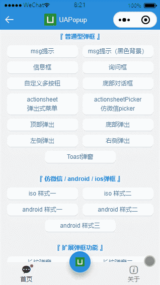
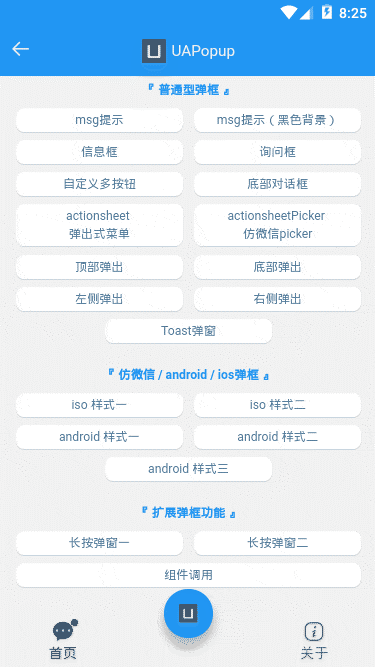
ua-popup 一款轻量级的uniapp自定义弹窗组件。汇集了android、ios和微信弹窗效果(msg消息、alert提示框、dialog对话框、actionsheet底部动作框、toast轻提示、长按定位菜单)等功能。
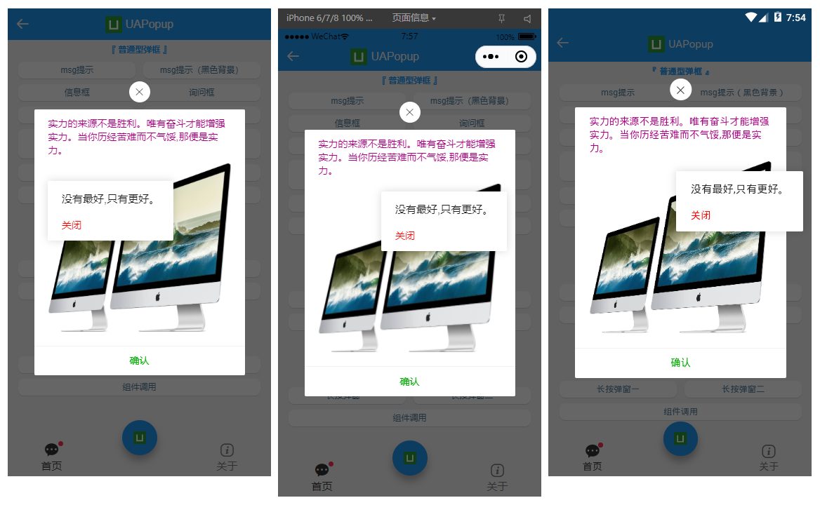
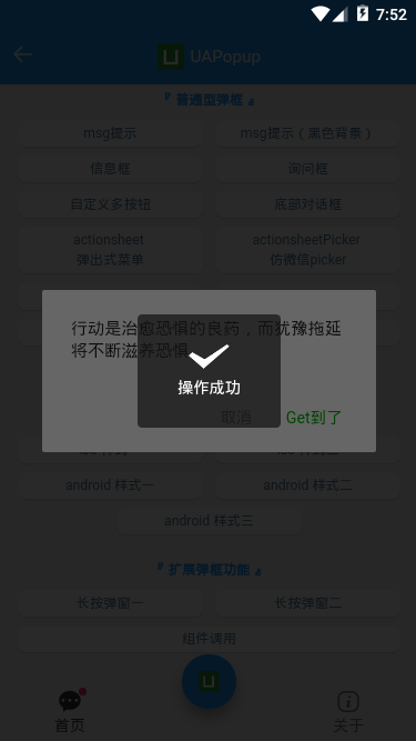
如下图:H5+App端+小程序效果,亲测多端运行一致。
◆ 引入使用
▍在main.js中引入uapopup弹框组件
// 引入自定义弹框组件
import uaPopup from ‘./components/ua-popup/index.vue‘
Vue.component(‘ua-popup‘, uaPopup)
说明:自HBuilderX 2.5.5起支持easycom组件模式。只要组件在components目录,并且符合 components/ua-popup/ua-popup.vue 结构。则无需引入组件,直接在页面使用即可。
UApopup支持标签组件式+函数式两种调用方式。
- 标签式
<!-- msg提示(自定义背景) -->
<ua-popup
    v-model="showMsgBg"
    anim="footer"
    content="hello uniapp"
    shade="false"
    time="2"
    :custom-style="{‘backgroundColor‘: ‘rgba(0,0,0,.6)‘, ‘color‘: ‘#fff‘}"
/>

<!-- 询问框 -->
<ua-popup v-model="showConfirm" shadeClose="false" title="标题" xclose z-index="2001"
    content="<div style=‘color:#ff557f;padding:20px 40px;‘>一切都将一去杳然,任何人都无法将其捕获。</div>"
    :btns="[
        {text: ‘取消‘, click: hideConfirm},
        {text: ‘确定‘, style: ‘color:#00aa00;‘, click: handleInfo},
    ]"
/>
- 函数式
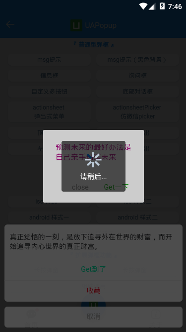
<script>
export default {
    methods: {
        // 函数式嵌套调用
        handleInfo() {
            let $ua = this.$refs.uapopup
            let $toast = this.$refs.uatoast
            $ua.open({
                content: ‘人生漫漫,且行且珍惜‘,
                customStyle: {‘background-color‘: ‘rgba(170, 0, 127, 0.6)‘, ‘color‘: ‘#fff‘},
                time: 3,
                onClose() {
                    $ua.open({
                        type: ‘android‘,
                        content: ‘<div style="color:#aa007f">预测未来的最好办法是自己亲手创造未来</div>‘,
                        customStyle: {‘width‘: ‘200px‘},
                        btns: [
                            {
                                text: ‘close‘, click() {
                                    $ua.close()
                                }
                            },
                            {
                                text: ‘Get一下‘,
                                style: ‘color:#00aa00;‘,
                                click() {
                                    $toast.open({
                                        type: ‘toast‘,
                                        icon: ‘loading‘,
                                        content: ‘请稍后...‘,
                                        opacity: .2,
                                        time: 2,
                                    })
                                }
                            }
                        ]
                    })
                }
            })
        },
    }
}
</script>
说明:一些简单的提示使用函数式调用足以,如果复杂的模板展示,则推荐使用组件式调用(支持slot插槽)
- 简单消息提示
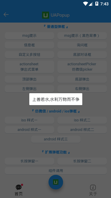
<ua-popup v-model="showMsg" anim="fadeIn" content="上善若水,水利万物而不争" shadeClose="false" time="3" />
- 底部弹框效果
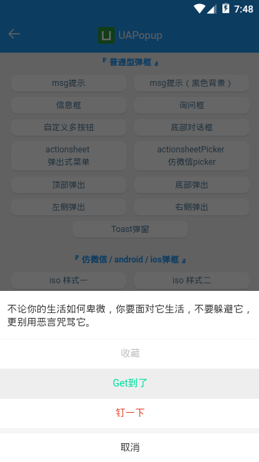
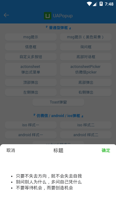
<!-- 底部对话框 -->
<ua-popup v-model="showFooter" anim="footer" type="footer" :shadeClose="false"
    content="真正觉悟的一刻,是放下追寻外在世界的财富,而开始追寻内心世界的真正财富。"
    :btns="[
        {text: ‘Get到了‘, style: ‘color:#00e0a1;‘, click: handleInfo},
        {text: ‘收藏‘, style: ‘color:#ee0a24;‘},
        {text: ‘取消‘, style: ‘color:#a9a9a9;‘, click: hideFooter},
    ]"
/>

<!-- ActionSheet底部弹出式菜单 -->
<ua-popup v-model="showActionPicker" anim="footer" type="actionsheetPicker" round title="标题"
    :btns="[
        {text: ‘取消‘},
        {text: ‘确定‘, style: ‘color:#00aa00;‘, click: handleInfo},
    ]"
>
    <!-- 自定义内容 -->
    <ul class="list" style="padding:50px;">
        <li>只要不失去方向,就不会失去自我</li>
        <li>别问别人为什么,多问自己凭什么</li>
        <li>不要等待机会,而要创造机会</li>
    </ul>
</ua-popup>
- 轻提示loading
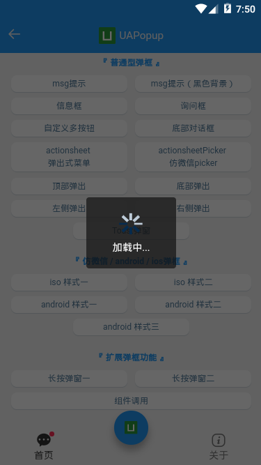
<ua-popup v-model="showToast" type="toast" icon="loading" time="2" content="加载中..." />
<!-- <ua-popup v-model="showToast" type="toast" icon="success" shade="false" time="2" content="成功提示" /> -->
<!-- <ua-popup v-model="showToast" type="toast" icon="fail" shade="false" time="2" content="失败提示" /> -->
<!-- <ua-popup v-model="showToast" type="toast" icon="warn" shade="false" time="2" content="警告提示" /> -->
<!-- <ua-popup v-model="showToast" type="toast" icon="info" shade="false" time="2" content="普通提示" /> -->
- 长按菜单效果
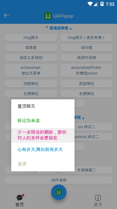
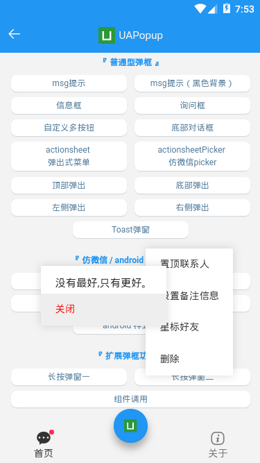
<!-- 长按弹窗1 -->
<ua-popup v-model="showContextMenu1" type="contextmenu" :follow="follow1" opacity=".35"
    :btns="[
        {text: ‘置顶聊天‘, click: handleContextPopup},
        {text: ‘标记为未读‘, style: ‘color:#00aa00;‘},
        {text: ‘少一点预设的期盼,那份对人的关怀会更自在‘, style: ‘color:#ff007f;‘},
        {text: ‘心有多大,舞台就有多大‘, style: ‘color:#09f;‘},
        {text: ‘关闭‘, style: ‘color:#aaaa7f;‘, click: hideContextMenu1},
    ]"
>
</ua-popup>

<!-- 长按弹窗2 -->
<ua-popup v-model="showContextMenu2" type="contextmenu" :follow="follow2" opacity="0"
    :btns="[
        {text: ‘置顶联系人‘, click: handleContextPopup},
        {text: ‘设置备注信息‘},
        {text: ‘星标好友‘},
        {text: ‘删除‘, click: hideContextMenu1},
    ]"
>
</ua-popup>
注意:需要传入follow坐标点参数。
// 长按菜单操作
handleContextMenu1(e) {
    this.showContextMenu1 = true;
    this.follow1 = [e.touches[0].clientX, e.touches[0].clientY]
},
very nice! 是不是觉得这款插件还不错,也是倒腾了几个通宵搞出来的。尤其调试nvue页面,简直让人有点抓狂~~??
◆ UApopup编码实现
- 支持20+参数配置
props: {
    // 接收父组件中v-model的值
    value: { type: Boolean, default: false },
    title: String,
    content: String,
    type: String,
    customStyle: { type: Object, default: null },
    icon: String,
    shade: { type: [Boolean, String], default: true },
    shadeClose: { type: [Boolean, String], default: true },
    opacity: { type: [Number, String], default: ‘‘ },
    round: Boolean,
    xclose: Boolean,
    xposition: { type: String, default: ‘right‘ },
    xcolor: { type: String, default: ‘#333‘ },
    anim: { type: String, default: ‘scaleIn‘ },
    position: String,
    follow: { type: Array, default: null },
    time: { type: [Number, String], default: 0 },
    zIndex: { type: [Number, String], default: ‘202107‘ },
    btns: {
        type: Array, default: null
    },
    // 打开弹框回调
    onOpen: { type: Function, default: null },
    // 关闭弹框回调
    onClose: { type: Function, default: null },
},
- 弹框模板
<template>
    <!-- #ifdef APP-NVUE -->
    <view v-if="opts.visible" class="ua__popup" :class="{‘ua__popup-closed‘: closeAnim}">
    <!-- #endif -->
    <!-- #ifndef APP-NVUE -->
    <view v-show="opts.visible" class="ua__popup" :class="{‘ua__popup-closed‘: closeAnim}">
    <!-- #endif -->
        <!-- 遮罩层 -->
        <view v-if="opts.shade && opts.shade!=‘false‘" class="uapopup__overlay" @touchstart="handleShadeClick" :style="{‘opacity‘: opts.opacity >= 0 ? opts.opacity : ‘‘, ‘z-index‘: oIndex-1}"></view>
        <!-- 窗口层 -->
        <view class="uapopup__wrap" :style="{‘z-index‘: oIndex}">
            <view class="uapopup__child" :id="‘uapopup-‘+uuid" :class="[‘anim-‘+opts.anim, opts.type&&‘popui__‘+opts.type, opts.round&&‘round‘, opts.position]" :style="[opts.follow&&positionStyle, opts.customStyle]">
                <!-- //标题 -->
                <view v-if="opts.title || $slots.title" class="uapopup__title">
                    <template v-if="$slots.title"><slot name="title" /></template>
                    <rich-text v-else :nodes="opts.title"></rich-text>
                </view>

                <!-- //toast -->
                <!-- <view v-if="opts.type==‘toast‘&&opts.icon" class="toast__icons" :class="[‘toast__icons-‘+opts.icon]" :style="{‘background-image‘: `url(${toastIcon[opts.icon]})`}"></view> -->
                <image v-if="opts.type==‘toast‘&&opts.icon" class="toast__icons" :class="[‘toast__icons-‘+opts.icon]" :src="toastIcon[opts.icon]" mode="widthFix"></image>
                <!-- //内容 -->
                <view v-if="opts.content || $slots.content" class="uapopup__content">
                    <template v-if="$slots.content"><slot name="content" /></template>
                    <rich-text v-else :nodes="opts.content"></rich-text>
                </view>
                <slot />

                <!-- //按钮组 -->
                <view v-if="opts.btns" class="uapopup__actions">
                    <rich-text v-for="(btn,index) in opts.btns" :key="index" class="btn" :class="{‘disabled‘: btn.disabled}" :style="btn.style" @click="handleBtnClick($event, index)" :nodes="btn.text"></rich-text>
                </view>

                <!-- //关闭按钮 -->
                <view v-if="opts.xclose" class="uapopup__xclose" :class="opts.xposition" :style="{‘color‘: opts.xcolor}" @click="close"></view>
            </view>
        </view>
    </view>
</template>

/**
 * @Desc     uniapp全端自定义弹框组件
 * @Time     andy by 2021/7/10
 * @About    Q:282310962  wx:xy190310
 */
<script>
    let index = 0
    export default {
        ...
        data() {
            return {
                // 混入props参数,处理函数式调用
                opts: {
                    visible: false,
                },
                toastIcon: {
                    ...
                },
                closeAnim: false,
                oIndex: 202107,
                timer: null,
                // 长按定位初始化(避免弹框跳动闪烁)
                positionStyle: { position: ‘absolute‘, left: ‘-999px‘, top: ‘-999px‘ },
            }
        },
        watch: {
            value(val) {
                const type = val ? ‘open‘ : ‘close‘
                this[type]()
            }
        },
        computed: {
            uuid() {
                return Math.floor(Math.random() * 10000)
            },
        },
        methods: {
            // 打开弹框
            open(options) {
                if(this.opts.visible) return
                this.opts = Object.assign({}, this.$props, options)
                this.opts.visible = true

                // nvue 的各组件在安卓端默认是透明的,如果不设置background-color,可能会导致出现重影的问题
                // #ifdef APP-NVUE
                if(!this.opts.customStyle[‘background‘] && !this.opts.customStyle[‘background-color‘]) {
                    this.opts.customStyle[‘background‘] = ‘#fff‘
                }
                // #endif

                let _index = ++index
                this.oIndex = _index + parseInt(this.opts.zIndex)

                this.$emit(‘open‘)
                typeof this.opts.onOpen === ‘function‘ && this.opts.onOpen()

                // 长按处理
                if(this.opts.follow) {
                    ...
                }

                ...
            },
            // 关闭弹框
            close() {
                if(!this.opts.visible) return

                this.closeAnim = true
                setTimeout(() => {
                    this.opts.visible = false
                    this.closeAnim = false

                    this.$emit(‘input‘, false)
                    this.$emit(‘close‘)
                    typeof this.opts.onClose === ‘function‘ && this.opts.onClose()

                    this.timer && clearTimeout(this.timer)
                    delete this.timer
                }, 200)
            },

            ...

            // 获取dom宽高
            getDom(id) {
                return new Promise((resolve, inject) => {
                    uni.createSelectorQuery().in(this).select(‘#uapopup-‘ + id).fields({
                        size: true,
                    }, data => {
                        resolve(data)
                    }).exec()
                })
            },

            // 自适应坐标点
            getPos(x, y, ow, oh, winW, winH) {
                let l = (x + ow) > winW ? x - ow : x;
                let t = (y + oh) > winH ? y - oh : y;
                return [l, t];
            },
        }
    }
</script>
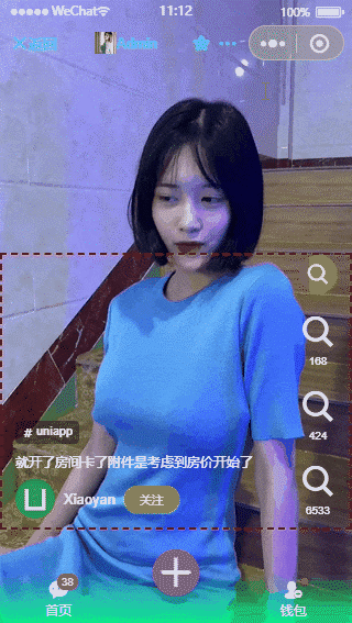
最后是运行在video页面效果图,完美的兼容性。
好了,基于uni-app开发多端自定义弹窗组件就分享到这里。希望对大家有点帮助哈!?
最后附上vue3+electron实例项目
electron+vue3跨端仿QQ聊天:https://www.cnblogs.com/xiaoyan2017/p/14454624.html
electron+vite2后台管理系统:https://www.cnblogs.com/xiaoyan2017/p/14776441.html