Go Up to FireMonkey Application Design
Contents
[hide]
- 1 Customizing the List View Appearance Properties
- 1.1 Footer properties
- 1.2 Header properties
- 1.3 List item properties
- 1.4 Edited list item properties
- 1.5 How to Modify List View Appearance Properties
- 2 Customizable Item Appearances
- 2.1 Using the DynamicAppearance Value
- 2.2 Using the Custom Value
- 3 The Toggle Design Mode
- 4 Create a Customized Appearance Class
- 4.1 How to use the Customized Appearance Class
- 5 See Also
- 5.1 Samples
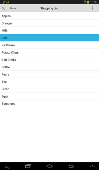
You can customize the appearance of a FireMonkey list view by modifying the layout of the list items, including the caption, the associated image, text details, or the accessory icon.

Customizing the List View Appearance Properties
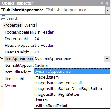
At design time, you can change the footer, header, and the list items appearance (also for the editing mode) by modifying the values of the properties in the ItemAppearance property. The ItemAppearance property controls the footer, the header, and the item appearance size (normal and in editing mode).
The following appearance properties of a ListView are grouped in the Object Inspector and in the StructureView, and you can modify their values to customize your list view appearance.
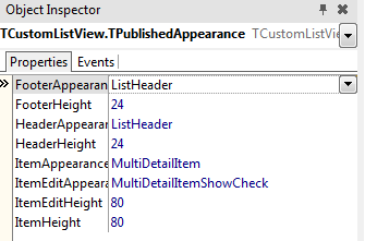
- FooterHeight. This property designates the list footer height (in pixels). Default value:
24. - FooterAppearance. This property designates the footer graphical appearance. Possible values are:
CustomandListHeader. Default value:ListHeader.
Header properties
- HeaderHeight. This property designates the list header height (in pixels). Default value:
24. - HeaderAppearance. This property designates the header graphical appearance. Possible values are:
CustomandListHeader. Default value:ListHeader.
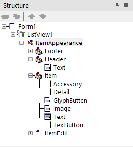
List item properties
- ItemHeight. This property designates the item height (in pixels). Default value:
44. - ItemAppearance. This property designates the item graphical appearance (image, caption, accessory button, etc.). Default value:
ListItem.
- Choose between the following values:
| Property | Visible objects |
|---|---|
| Custom | See Using the Custom Value |
| DynamicAppearance | See Using the DynamicAppearance Value |
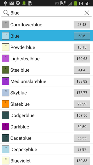
| ImageListItem | An image, a caption, and an accessory graphical button |
| ImageListItemBottomDetail | An image, a caption, a detail text, and an accessory graphical button |
| ImageListItemBottomDetailRightButton | An image, a caption, a detail text, and an accessory text button |
| ImageListItemRightButton | An image, a caption, and an accessory text button |
| ListItem | A caption and an accessory graphical button |
| ListItemRightDetail | A caption, a detail text, and an accessory graphical button |
See FMX.ListViewCustomBottomDetail Sample and other Samples.
Edited list item properties
- ItemEditHeight. This property designates the item height (in pixels) when in edit mode. Default value:
44. - ItemEditAppearance. This property designates the item graphical appearance when in edit mode. Default value:
ListItemShowCheck.
- Choose between the following values:
| Property | Visible objects |
|---|---|
| Custom | See Using the Custom Value |
| DynamicAppearance | See Using the DynamicAppearance Value |
| ImageListItemBottomDetailRightButtonShowCheck | An image, a caption, a detail text, a check box glyph button, and a text button |
| ImageListItemBottomDetailShowCheck | An image, a caption, a detail text, a check box glyph button, and an accessory graphical button |
| ImageListItemDelete | An image, a caption, a delete glyph button, and an accessory graphical button |
| ImageListItemRightButtonDelete | An image, a caption, a delete glyph button, and a text button |
| ImageListItemRightButtonShowCheck | An image, a caption, a check box glyph button, and a text button |
| ImageListItemShowCheck | An image, a caption, a check box glyph button, and an accessory graphical button |
| ListItemDelete | A caption, a delete glyph button, and an accessory graphical button |
| ListItemRightDetailDelete | A caption, a detail text, a delete glyph button, and an accessory graphical button |
| ListItemRightDetailShowCheck | A caption, a detail text, a check box glyph button, and an accessory graphical button |
| ListItemShowCheck | A caption, a check box glyph button, and an accessory graphical button |
See FMX.ListViewCustomBottomDetail Sample and other Samples.
How to Modify List View Appearance Properties
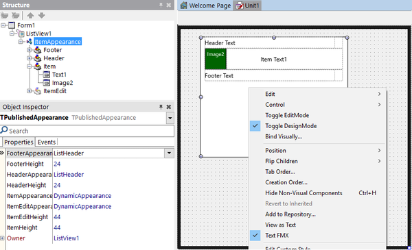
Use the StructureView and the Object Inspector to find the List View component.
- In the Structure View, locate the ListView component and then click
ItemAppearancein the hierarchy. - In the Object Inspector, modify each property (FooterAppearance, HeaderAppearance, ItemAppearance, ItemEditAppearance) to the desired value.
Customizable Item Appearances
The DynamicAppearance and Custom values allows you to customize the appearance of the items in a ListView. You can use the Customvalue for the FooterAppearance, HeaderAppearance, ItemAppearance and ItemEditAppearance properties of the items in the ListView, while you can use the DynamicAppearance for the ItemAppearance and ItemEditAppearance properties of the items in the ListView. You can also use built-in search filtering with the DynamicAppearance mode (*added in Subscription Update 1).
Using the DynamicAppearance Value
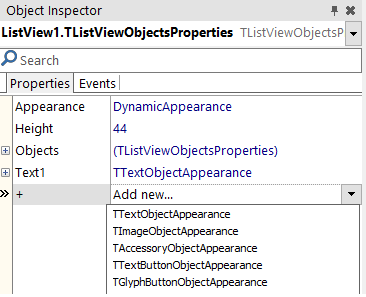
The DynamicAppearance allows you to dynamically customize the item appearance of the ListView at design time. The difference between DynamicAppearance and the other item appearance properties is that the DynamicAppearance allows you to add as many objects as you want to the appearance of your item.
By default, the DynamicAppearence contains a single text object. To add more objects, select Item from IteamAppearance in theStructureView. Then, in the Object Inspector, click the + property and select any of the available objects. The available objects are:
- TTextObjectAppearance. Describes the graphical appearance of the text object of the list view item.
- TImageObjectAppearance. Describes the graphical appearance of the icon object of the list view item.
- TAccessoryObjectAppearance. Describes the graphical appearance of the accessory object of the list view item.
- TTextButtonObjectAppearance. Describes the graphical appearance of the text button object of the list view item.
- TGlyphButtonObjectAppearance. Describes the graphical appearance of a glyph button (graphical image) of the list view item.
You can customize the objects of the item appearance at design time by selecting an object in the StructureView and changing its properties in the Object Inspector. Among the things you can customize, these are some examples: the font type, text size or text alignment in text objects or the button type in button objects. Moreover, you can visually customize the objects of the item appearance enabling the Toggle DesignMode.
-
Tip: As you can add as many objects as you want, it is highly recommended to use the
DynamicAppearance with the
Toggle DesignMode enabled.
Using the Custom Value
Selecting the Custom appearance value enables the following objects in the item appearance:
- Accessory. It is an instance of TAccessoryObjectAppearance. Not visible by default.
- Detail. It is an instance of TTextObjectAppearance. Not visible by default.
- GlyphButton. It is an instance of TGlyphButtonObjectAppearance. Not visible by default.
- Image. It is an instance of TImageObjectAppearance. Not visible by default.
- Text. It is an instance of TTextObjectAppearance. Visible by default.
- TextButton. It is an instance of TTextButtonObjectAppearance. Not visible by default.
-
Note: You can customize the objects of the item appearance at design time by changing their properties using the
Object Inspector or enabling the Toggle DesignMode.
-
Note: You can customize the objects of the item appearance at design time by changing their properties using the
To set the visibility of the desired objects:
- Enable the Visible property (by setting its value to
True) in the Object Inspector for any of the desired objects and modify the properties according to your needs. - Enable the Visible property for any of the objects, by setting it to
Truein the source code.
Delphi:
AItem.Objects.AccessoryObject.Visible := True;
C++:
void __fastcall TForm1::SetEditItemProperties( TItemAppearanceObjects * AObjects) { AObjects->GlyphButton->Visible = true; }
The Toggle Design Mode
The Toggle DesignMode allows you to visually customize the item appearance of a ListView at design time. You can select this mode for any ItemAppearance property (Custom, DynamicAppearance, ListItem, ImageListItem, etc.).
-
Tip: The
Toggle DesignMode is highly recommended when using the DynamicAppearance because the
DynamicAppearance allows you to freely customize the ItemAppearance.
To select the Toggle DesignMode, right-click the TListView object in the StructureView or in the TForm and select it. The Toggle DesignMode changes the design-time view of the ListView object from a blank box to a design preview of the ListView item. Then, you can:
- Visually customize the item appearance in the form.
- Visualize the changes that you make to the item appearance properties using the Object Inspector.
Create a Customized Appearance Class
You can create and install a new customized appearance class and use it in your design, by installing a new package. This package defines the classes that implement a custom appearance for list view items. You can customize the fields as necessary, to implement a rating image for instance (a control that shows a different image based on a numeric value).
How to use the Customized Appearance Class
- Implement a new TListView appearance package. The following samples contain different examples that customize the list view appearance to show:
- A thumbnail with a caption
- A rating as an image
- A detail text at the bottom of the items
- Three detail text items
- Install the customized appearance package in the IDE.
- Once installed, the new appearance can be used with a TListView component in the Object Instpector.
-
Note: The
MultiDetailItem value is a customized appearance package, previously installed in the IDE.
See Also
- Mobile Tutorial: Using LiveBindings to Populate a ListView (iOS and Android)
- FireMonkey Native iOS Controls
- FMX.ListView.TAppearanceListView.ItemAppearance
- FMX.ListView.Appearances.TPublishedAppearance.FooterHeight
- FMX.ListView.Appearances.TPublishedAppearance.FooterAppearance
- FMX.ListView.Appearances.TPublishedAppearance.HeaderHeight
- FMX.ListView.Appearances.TPublishedAppearance.HeaderAppearance
- FMX.ListView.Appearances.TPublishedAppearance.ItemHeight
- FMX.ListView.Appearances.TPublishedAppearance.ItemAppearance
- FMX.ListView.Appearances.TPublishedAppearance.ItemEditHeight
- FMX.ListView.Appearances.TPublishedAppearance.ItemEditAppearance
Samples
- FMX.ListViewAddThumbAndCaption Sample
- FMX.ListViewRatingsAppearance Sample
- FMX.ListViewCustomBottomDetail Sample
- FMX.ListViewMultiDetailAppearance Sample
- FMX
- XE7
http://docwiki.embarcadero.com/RADStudio/Berlin/en/Customizing_FireMonkey_ListView_Appearance