
本文将利用border属性实现简单几何的绘制;
效果图:
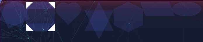
正八角星
说明:采用两个正方形以中心进行旋转叠加;
/* 八角星 */
    #burst-8 {
        background: #6376ff1f;
        width: 80px;
        height: 80px;
        position: relative;
        text-align: center;
        transform: rotate(20deg);
    }

    #burst-8:before {
        content: "";
        position: absolute;
        top: 0;
        left: 0;
        height: 80px;
        width: 80px;
        background: #6376ff1f;
        transform: rotate(135deg);
    }
正六边形
说明:将长方形,与两个三角形拼接;
 /* 正六边形 */
    #hexagon {
        width: 100px;
        height: 55px;
        background: #6376ff1f;
        position: relative;
        top: 25px;
    }

    #hexagon:before {
        content: "";
        position: absolute;
        top: -25px;
        left: 0;
        width: 0;
        height: 0;
        border-left: 50px solid transparent;
        border-right: 50px solid transparent;
        border-bottom: 25px solid #6376ff1f;
    }

    #hexagon:after {
        content: "";
        position: absolute;
        bottom: -25px;
        left: 0;
        width: 0;
        height: 0;
        border-left: 50px solid transparent;
        border-right: 50px solid transparent;
        border-top: 25px solid #6376ff1f;
    }
平行四边形
说明:采用矩形skew倾斜的方式;
#ping {
        height: 50px;
        width: 100px;
        transform: skew(20deg);
        background: #6376ff1f;
    }
椭圆
说明:采用矩形border-radius的方式;
#tuoyuan {
        height: 50px;
        width: 100px;
        border-radius: 50%;
        background: #6376ff1f;
    }
心形
说明:将正方形旋转45度,与两个直径和其半径相同的半圆进行旋转、平移、拼接;
/* 心形 */
    #heart {
        height: 50px;
        width: 50px;
        background: #6376ff1f;
        transform: rotate(45deg);
    }

    #heart:before {
        position: absolute;
        content: "";
        left: -25px;
        top: 0px;
        width: 50px;
        height: 25px;
        transform: rotate(-90deg);
        background: #6376ff1f;
        transform-origin: bottom;
        border-radius: 50px 50px 0 0;
    }

    #heart:after {
        position: absolute;
        content: "";
        left: 0px;
        top: -25px;
        width: 50px;
        height: 25px;
        background: #6376ff1f;
        border-radius: 50px 50px 0 0;
    }
六角星
说明:采用两个等腰三角形进行叠加;
/* 六角星 */
    #star-six {
        width: 0;
        height: 0;
        border-left: 50px solid transparent;
        border-right: 50px solid transparent;
        border-bottom: 100px solid #6376ff1f;
        position: relative;
    }
    #star-six:after {
        width: 0;
        height: 0;
        border-left: 50px solid transparent;
        border-right: 50px solid transparent;
        border-top: 100px solid #6376ff1f;
        position: absolute;
        content: "";
        top: 30px;
        left: -50px;
    }