纯CSS代码加上<div>制作动画版哆啦A梦(机器猫)
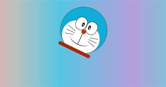
哆啦A梦(机器猫)我们大家一定都很熟悉,今天给大家演示怎么用纯CSS。代码,来做一个动画版的哆啦A梦.
效果图:

###下面代码同学可以查看一下,每个线条及椭圆都是纯CSS代码生成。
首先分析结构
根据原图,将哆啦A梦分为几个结构,然后再分解其他部位。
- 画出各部分的形状和颜色,然后使用绝对定位(absolute)和相对定位(relative)改变其位置。
- 各种带弧度形状,使用border-radius属性实现。
- 倾斜角度,使用transform属性实现。
-
使用background属性的-webkit-gradient() / -moz-linear-gradient() 画出身体部分的线性色彩变化。
html代码如下:
<!DOCTYPE html>
<html lang="en">
<head>
 <meta charset="UTF-8">
 <title>哆啦A梦(机器猫)动画版</title>
</head>
<body>
  <!-- content是整个哆啦A梦的主体 -->
  <div class="content">
      <!-- 哆啦A梦的头部 -->
      <div class="head"></div>
      <!-- 哆啦A梦的脸部 -->
      <div class="face">
      </div>
      <div class="eye">
          <div></div>
          <div></div>
      </div>
      <div class="eye-2">
          <div>
              <div></div>
          </div>
          <div>
              <div></div>
          </div>
      </div>
      <!-- 哆啦A梦的鼻子 -->
      <div class="nose">
          <div class="nose-2"></div>
          <div class="nose-3"></div>
      </div>
      <!-- 哆啦A梦的胡子 -->
      <div class="huzi">
          <div></div>
          <div></div>
          <div></div>
          <div></div>
          <div></div>
          <div></div>
      </div>
      <div class="huzi2">
          <div></div>
          <div></div>
          <div></div>
          <div></div>
          <div></div>
          <div></div>
      </div>
      <!-- 哆啦A梦围巾 -->
      <div class="weijin"></div>
  </div>
</body>
</html>
css代码如下:
<style>
        /*给背景设置渐变色*/
        body {
            background-image:linear-gradient(to right, #eea2a2 0%, #bbc1bf 19%, #57c6e1 42%, #b49fda 79%, #7ac5d8 100%);
        }
        /*给哆啦A梦整体设置宽度*/
        .content{
            width: 333px;
            height: 350px;
            position: relative;
            margin: 50px auto;
            /*让content 执行keyframes动画*/
            animation: play 5s linear infinite;
        }

        /*头设置*/
        .head {
            width: 325px;
            height: 325px;
            border-radius: 50%;
            background-color: #0dacd7;
            border: 2px solid #555555;
            transition: 3s;
        }
        /*脸设置*/
        .face{
            width: 270px;
            height: 200px;
            background-color: white;
            border-radius: 130px;
            position: absolute;
            top: 115px;
            left: 31px;
            transition: 3s;
        }
        /*眼睛设置*/
        .eye {
            width: 158px;
            position: absolute;
            top: 82px;
            left: 90px;
            transition: 3s;
        }
        .eye>div{
            width: 75px;
            height: 90px;
            background-color: white;
            border: 2px solid black;
            border-radius: 40px;
            float: left;
            transition: 3s;
        }
        .eye-2>div{
            width: 17px;
            height: 30px;
            border-radius: 50%;
            background-color: black;
            position: relative;
        }
        .eye-2>div:nth-child(1){
            position: absolute;
            top: 116px;
            left: 136px;
        }
        .eye-2>div:nth-child(2){
            position: absolute;
            top: 116px;
            left: 184px;
        }
        .eye-2>div>div {
            width: 9px;
            height: 9px;
            background-color: white;
            border-radius: 50%;
            position: absolute;
            top: 13px;
            left: 5px;
        }
        /*鼻子设置*/
        .nose{
            width: 32px;
            height: 32px;
            background-color: #c93300;
            border-radius: 50%;
            position: absolute;
            top: 159px;
            left: 153px;
        }
        .nose-2 {
            width: 3px;
            height: 80px;
            background-color: black;
            position: absolute;
            top: 32px;
            left: 14px;
        }
        .nose-3 {
            width: 147px;
            height: 77px;
            border-bottom: 3px solid black;
            border-radius: 50%;
            position: absolute;
            top: 35px;
            left: -58px;
        }
        /*围巾设置*/
        .weijin{
            width: 240px;
            height: 24px;
            background-color: #ab2800;
            border-radius: 9px;
            position: absolute;
            top: 305px;
            left: 45px;
        }
        /*胡子设置*/
        .huzi {
            position: absolute;
            top: 186px;
            left: 54px;
        }
        .huzi>div:nth-child(1){
            width: 60px;
            height: 2px;
            background-color: black;
            transform: rotate(15deg);
            transition: 3s;
        }

        .huzi>div:nth-child(2){
            width: 60px;
            height: 2px;
            background-color: black;
            margin-top: 20px;
            margin-bottom: 20px;
            transition: 3s;
        }
        .huzi>div:nth-child(3){
            width: 60px;
            height: 2px;
            background-color: black;
            transform: rotate(-15deg);

        }

        .huzi2 {
            position: absolute;
            top: 186px;
            left: 224px;
        }
        .huzi2>div:nth-child(1){
            width: 60px;
            height: 2px;
            background-color: black;
            transform: rotate(165deg);
        }

        .huzi2>div:nth-child(2){
            width: 60px;
            height: 2px;
            background-color: black;
            margin-top: 20px;
            margin-bottom: 20px;
        }
        .huzi2>div:nth-child(3){
            width: 60px;
            height: 2px;
            background-color: black;
            transform: rotate(-165deg);

        }
        /*设置哆啦A梦移动路径的动画*/
        @keyframes play {
            0{
                transform: rotate(0deg) translateX(0);

            }
            15%{
                transform:  translateX(400px) rotate(190deg);

            }
            30%{
                transform: translateX(0px) rotate(-80deg);
            }
            45%{
                transform: translateX(-400px) rotate(-175deg);
            }
            60%{
                transform: translateX(-100px) rotate(-20deg);
            }
            80%{
                transform: rotate(190deg) translateY(-300px);
            }
            100%{
                transform: rotate(-20   deg) translateY(200px);
            }
        }
    </style>