
1. 选择类
 1.1 /* 鼠标选中区域,改变背景/字体颜色 */
        /*遍历写法*/
        div::selection {
            background-color: red;
            color: #fff;    /* font-size、font-weight等 设置不起作用 */
        }

        /*全局写法*/
        ::selection {
            background: #000;
            color: #fff;
2. 文字类
2.1 /* 伪元素选择器 */
    /* 第一个字母/汉字 */
      li::first-letter {
          color:red;
          background-color: yellow;
      }

    /* 第一行 */
      div::first-line {
          background-color: green;
      }
    /*大小写转换*/
      .tit{
          /*text-transform: capitalize;/!*首字母大写*!/*/
          /*text-transform: uppercase;/!*所有单词转换为大写*!/*/
          text-transform: lowercase;/*所有单词转换为小写*/
      }
2.2 /*文字多出部分省略号代替 仅适用于单行文本*/
        p{
            white-space:nowrap;
            text-overflow:ellipsis;
            overflow: hidden;
        }
2.3 /*设置文本纵向排列*/
        .title{
            width: 20px;
            writing-mode: tb-rl;
            letter-spacing: 20px;
            text-indent: 30px;
        }
3. 外观样式类
3.1 /*设置单选框样式*/
      input {
              width: 20px;
              height: 20px;
              padding-left: 22px;
              cursor: pointer;
              background: url(images/check.png) no-repeat 2px 1px;
              -webkit-appearance: none;
      }
设置后的样式: 
3.2 /*设置div宽度100%,两边留白(也可设置于高度)*/
    .box{
        width: -webkit-calc(100% - 50px);
        width: calc(100% - 50px);
        height: 300px;
        margin: 0 auto;
        background: #ccc;
        overflow: hidden;
    }
设置后的样式:

 3.3 /*设置光标不能点击*/
        .btn{
            cursor: no-drop;
        }

3.4 /* 设置textarea文本框不能拖拽缩放 */
        textarea{
            resize: none;
        }
3.5 /* 圆角边框 */
.box{
    width:100px;
    height:100px;
    border-radius: 10px 20px;
    border: 1px solid red;
}
10px; 一个值的时候即为设置上下左右边框
10px 20px; 依次为:上下边框 左右边框
10px 20px 30px; 上边框 左右边框 下边框
10px 20px 30px 40px; 上边框 右边框 下边框 左边框
3.6 /* box-shadow 盒子阴影 */      /* text-shadow 文本阴影 */

box-shadow:2px 2px 4px red inset; /* X轴偏移量 Y轴偏移量 阴影距离 阴影颜色 内阴影(可以不设置内阴影,默认为外阴影) */
text-shadow 语法和box-shadow 一致
浏览器在编译数字或者字母的时候默认不会自动换行,解决方法:
  div{
          width: 90px;  border: 1px solid red; word-break: break-all; word-warp: break-word;
   }
4. 动画类
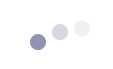
4.1 /* 加载loading */
CSS代码如下:
@keyframes bouncing-loader {
            from {
                opacity: 1;
                transform: translateY(0);
            }
            to {
                opacity: 0.1;
                transform: translateY(-1rem);
            }
        }
        .bouncing-loader {
            display: flex;
            justify-content: center;
        }
        .bouncing-loader > div {
            width: 1rem;
            height: 1rem;
            margin: 3rem 0.2rem;
            background: #8385aa;
            border-radius: 50%;
            animation: bouncing-loader 0.6s infinite alternate;
        }
        .bouncing-loader > div:nth-child(2) {
            animation-delay: 0.2s;
        }
        .bouncing-loader > div:nth-child(3) {
            animation-delay: 0.4s;
        }
HTML代码如下:
<div class="bouncing-loader">
    <div></div>
    <div></div>
    <div></div>
</div>
实现效果如下:
5. transform /*旋转 变形 */
 transform: rotate(-20deg); /*旋转*/
 transform: skew(45deg); /*扭曲*/
 transform: scale(0.8); /*缩放*/
 transform: translate(50px, 100px); /*位移*/
6. animation /* 动画 */
HTML代码如下:
.yun{
 position: absolute;
 left: 0;
 top: 90px;
 background: url(http://gzzta.com.cn/images/gzkdqggjyyj_zt/yun1.png) repeat-x;
 height: 100%;
 width: 300%;
 min-width:1200px;
 -webkit-animation: cloud_one 100s linear infinite;
 -moz-animation: cloud_one 100s linear infinite;
 -o-animation: cloud_one 100s linear infinite;
 animation: cloud_one 100s linear infinite;
 -webkit-transform: translate3d(0, 0, 0);
 -ms-transform: translate3d(0, 0, 0);
 -o-transform: translate3d(0, 0, 0);
 transform: translate3d(0, 0, 0);
}
 CSS代码如下:

 @-webkit-keyframes cloud_one {
            0% {
                left: 0
            }
            100% {
                left: 200px
            }
        }
        @keyframes cloud_one {
            0% {
                left: 0
            }
            50% {
                left: -100%
            }
            100% {
                left: -200%
            }
        }