CSS3(2)— 过渡(transition)
一、概念
1、什么是过渡
通俗理解 是从一个状态 渐渐的过渡到 另外一个状态。
比如一个盒子原先宽度为100px,当鼠标点击时盒子的宽度变成200px,如果直接从100px变化到200px。从视觉上看去并不友好。我们更喜欢看到的是平滑的过渡。
2、浮动的语法
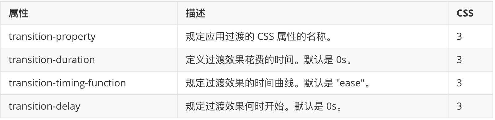
属性语法格式
transition: 要过渡的属性  花费时间  运动曲线  何时开始;
// 如果有多组属性变化,还是用逗号隔开。前两个属性必须写。后两个可以不写。运动曲线默认匀速。开始时间默认0秒。
属性值

注意
- 如果想要所有的属性都变化过渡, 写一个all 就可以
- transition-duration 花费时间 单位是 秒 s (这个秒是一定需要的)
- 运动曲线 默认是 ease
- 默认是 0s 立马开始
- 过渡写到本身上 谁做过渡动画,写到谁身上(下面例子说明)
运动曲线示意图

二、示例
1、示例一
效果

代码
<!DOCTYPE html>
<html lang="en">
<head>
    <meta charset="UTF-8">
    <title>css3过渡</title>
    <style> div { width: 100px; height: 100px; background-color: pink; /*transition: width 0.5s ease 0s, height 0.3s; 多组属性用逗号分隔*/ transition: all 1s; /* 这里过渡是当前div,按照谁做过渡动画,写到谁身上,所以这里要写在这里*/ } div:hover { width: 400px; height: 300px; } </style>
</head>
<body>
    <div></div>
</body>
</html>
2、示例二
效果

代码
<!DOCTYPE html>
<html lang="en">
<head>
    <meta charset="UTF-8">
    <title>CSS过渡</title>
    <style> div { width: 183px; height: 130px; border: 1px solid red; overflow: hidden; /*多余部分隐藏*/ } div img { width: 193px; height: 130px; transition: all 0.4s; /*所以变化,过渡时间0.4秒*/ } div:hover img { margin-left: -10px; /*移动*/ } </style>
</head>
<body>
    <div>
        <img src="1.jpg" alt="">
    </div>
</body>
</html>
3、示例三
效果

代码
<!DOCTYPE html>
<html lang="en">
<head>
    <meta charset="UTF-8">
    <title>css过渡</title>
    <style> * { margin: 0; padding: 0; } li { list-style: none; } .subnav { margin: 100px auto; width: 20px; } .subnav li { width: 20px; height: 20px; margin: 3px 0; background-color: pink; position: relative; } .subnav div { position: absolute; /*子绝父相*/ right: 0; top: 0; height: 20px; width: 0; background-color: purple; transition: all 0.6s; z-index: -1; /*这里设置定位级别小于父类,所以父类浮在它上面*/ } .subnav li:hover div { width: 100px; } </style>
</head>
<body>
    <div class="subnav">
        <ul>
            <li>
                <div></div>
            </li>
            <li><div></div></li>
            <li><div></div></li>
            <li><div></div></li>
            <li><div></div></li>
        </ul>
    </div>
</body>
</html>
你如果愿意有所作为,就必须有始有终。(16)