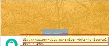
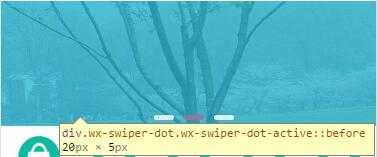
微信小程序的swiper组件是滑块视图容器,也就是说平常我们看到的轮播图就可以用它来做,不过这个组件有很多样式是固定的,但是,有时候我们的设计稿的面板指示点是需要个性化的,那么如何去修改swiper组件的面板指示点的样式呢?最近在使用swiper的时候也在想这个,最后发现在调试的时候,可以看到他的选择器。如图:


|
1
2
3
4
5
6
7
8
9
|
<swiper class="swiper-box" indicator-dots="{{ indicatordots }}" autoplay="{{ autoplay }}">
<block wx:for="{{ swiperItem }}">
<swiper-item>
<navigator url="{{ item.linkUrl }}">
<image class="slide-image" src="{{ item.imgUrl }}"></image>
</navigator>
</swiper-item>
</block>
</swiper>
|
|
1
2
3
4
5
6
7
8
9
10
11
12
13
14
15
16
17
18
19
|
.swiper-box .wx-swiper-dots.wx-swiper-dots-horizontal{
margin-bottom: 2rpx;
}
.swiper-box .wx-swiper-dot{
width:40rpx;
display: inline-flex;
height: 10rpx;
margin-left: 20rpx;
justify-content:space-between;
}
.swiper-box .wx-swiper-dot::before{
content: ‘‘;
flex-grow: 1;
background: rgba(255,255,255,0.8);
border-radius: 8rpx
}
.swiper-box .wx-swiper-dot-active::before{
background:rgba(244,0,0,0.8);
}
|

虽然可以通过上面的代码修改swiper面板指示点的样式,但是还是有局限性的,不过总算可以修改了,在此简单记录一下。。
.