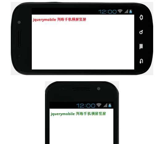
@media all and (orientation : landscape) {

h2{color:red;}/*横屏时字体红色*/

}

@media all and (orientation : portrait){

h2{color:green;}/*竖屏时字体绿色*/

}

@media all and (orientation : landscape) {
h2{color:red;}/*横屏时字体红色*/
}
@media all and (orientation : portrait){
h2{color:green;}/*竖屏时字体绿色*/
}